Gantt planning
Gantt planning
for multi-project setups

In short
A Gantt chart maps a project's tasks as bars along a timeline, making duration, sequence and dependencies visible. It only becomes a reliable plan once resources and parallel projects sit behind it. In Linetrack the bar chart is the surface of a cross-project data foundation: move one task and you immediately see which departments and which other projects it hits.











400+
Excel spreadsheets and
planning tools replaced
91%
named Excel and tool sprawl
as their starting problem
1512+
industrial projects
managed in parallel
10 days
from kick-off
to go-live
Every figure on this page comes from a full survey of all live Linetrack implementations, as of August 2026. Multiple answers were possible for the starting problems.
Definition
What is a Gantt chart?
A Gantt chart is a bar chart: every task appears as a horizontal bar on a timeline, its length the duration, its position the date. Henry Gantt popularised the format in production control from the 1910s onward. Today it has to do more than illustrate: carry dependencies, resources and a view across every parallel project.
The underlying idea is older than the name – Karol Adamiecki described a comparable harmonogram back in 1896. The principle has not changed since; the context has. A bar chart is no longer something you pin to a wall, it is the surface of live project planning and control. How Linetrack organises the structure, dates and tasks behind it is covered by the project planning module.
In practice
Why do Gantt charts in Excel fail?
Excel can draw bars – a date column, conditional formatting, done. The break does not happen when you draw the chart, it happens when you have to run it. Across the live Linetrack implementations surveyed, more than 400 planning tools were replaced, most of them Excel spreadsheets. 91% of customers named Excel and tool sprawl as one of their main reasons for switching (multiple answers possible).
Single-project planners such as MS Project solve the first two points: they understand task relationships and calculate the critical path - Linetrack does the same, with the capacity histogram right below it. They do not solve points three to five – a plan remains a file with exactly one owner. In those same implementations, MS Project plans were replaced too. Anyone running several projects at once therefore does not need a better file, but a shared data foundation: the step to multi-project management.
Core argument
A Gantt picture or a Gantt plan
A Gantt chart is trivial to draw and hard to run. Every spreadsheet, every presentation tool and every online Gantt tool can put bars on a timeline. The difference between a Gantt picture and a Gantt plan is not in the visualization – it is in what sits behind it.
A Gantt plan has three things behind the bar: dependencies that actually take effect when something moves. Resources that carry out the task. And a second, third and fourth project plan drawing on those same resources. Take one of them away and the bar chart is a status graphic.
The test is simple: drag one task two weeks later. A picture changes colour. A plan tells you which successor tasks move with it, which department is pushed beyond its capacity as a result, and which other project has booked the same design engineer for exactly that period.
That answer is precisely why the schedule view and the resource view are not separate in Linetrack: the bar chart and the capacity histogram sit on top of each other and read the same data. How that connection works in detail is covered on the scheduling and capacity planning page.

Inside Linetrack
The bar chart is a surface, not a file
In Linetrack the Gantt chart is not a separate document but a view onto the work breakdown structure. Work packages and tasks are created once; the bar chart shows them on the timeline – with task relationships, milestones and the progress reported back by the people doing the work.
Planning happens by drag and drop: pull a bar, extend it, link it. What is new is not the gesture but what it triggers. Every task carries the department and the hours that deliver it – which is why every shift is simultaneously a statement about resources. The wider frame is set out on the project planning and control overview.
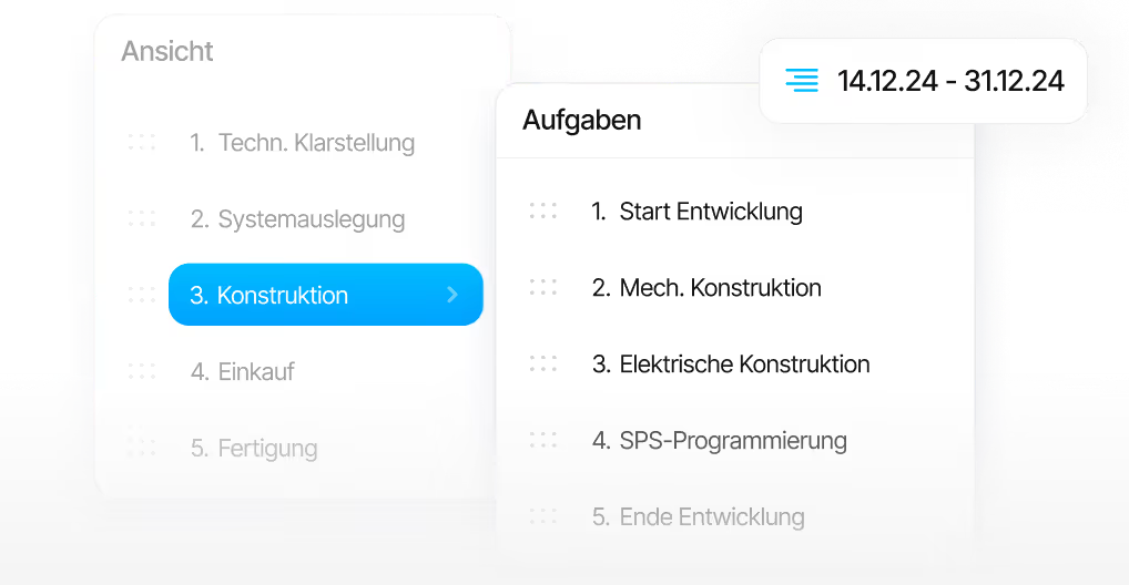
Because all projects live in the same data foundation, planning is not left to the project manager alone. Departments maintain their own tasks in the same plan, and the bar chart stays current without anyone collecting status by phone. That is the practical difference between multi-project management and twenty separately maintained files.
Impact
What happens when you move a task
Below the bar chart sits the capacity histogram: same timeline, same data, but the department's view instead of the project's. It shows available capacity and workload per department across all projects – not just the one currently open.
When a task moves, its hours move with it in the histogram. If that pushes a department beyond its capacity, you see it on the same screen – before the commitment to the customer, not after. How far plan and reality drift apart over time is then shown by the planned-versus-actual comparison.
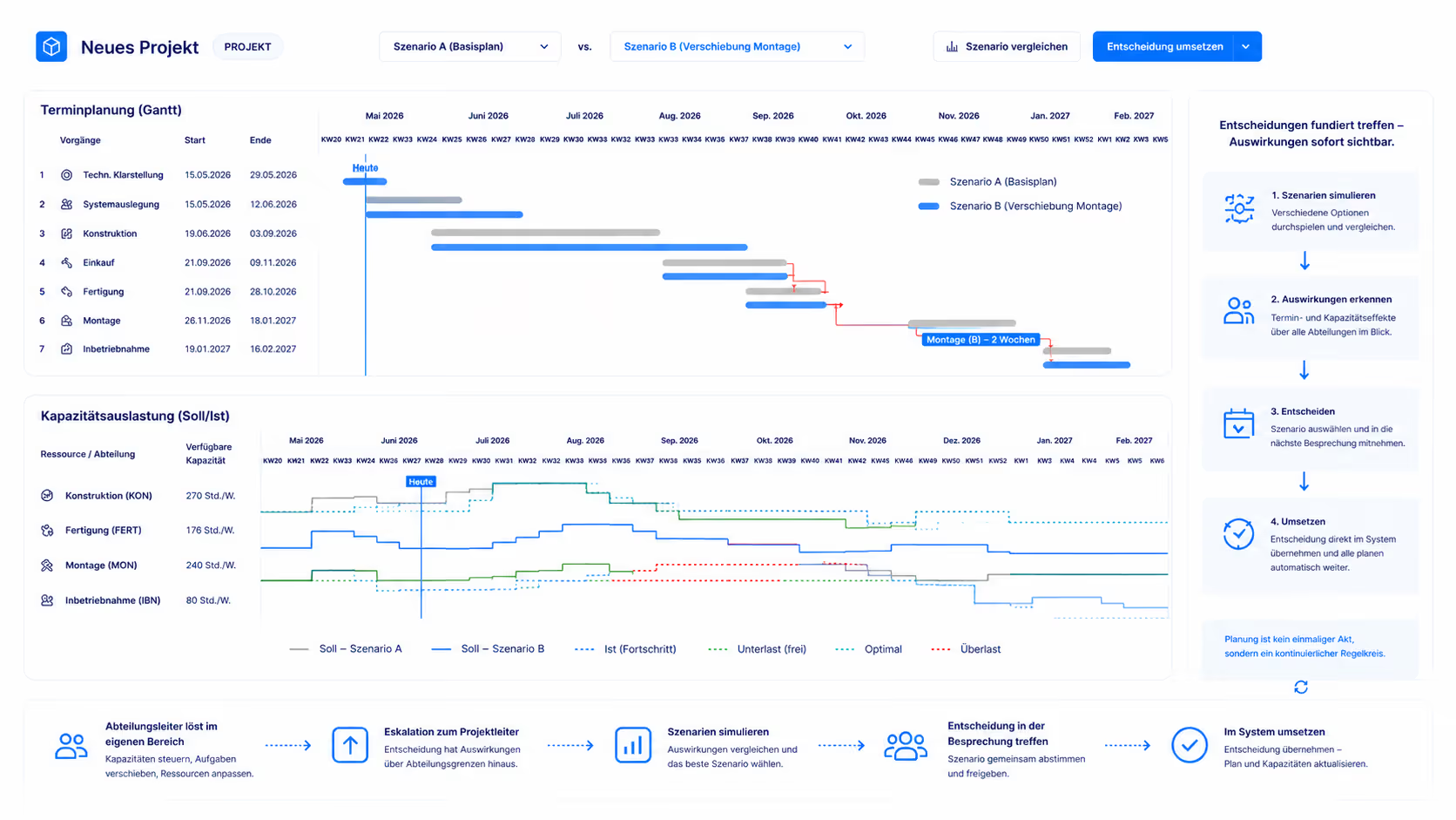
That lets you simulate a shift first and decide afterwards: alternative scenarios are played through in the system, taken into the project meeting and selected there. What Linetrack deliberately does not do is replan automatically. The software shows the consequence of a decision – the decision itself is made by people who know the customer, the machine and the commitment.
In comparison
Gantt in Excel or a single-project planner
versus Linetrack
The question is rarely whether a tool can display bars – they all can. The question is what happens on the second, fifth and twentieth project. Six points where a Gantt picture differs from a cross-project bar chart.
An online Gantt tool solves distribution: everyone sees the same state in the browser, nobody works from an outdated copy. It does not answer whether that state is feasible – for that, capacity has to live in the same system. This distinction runs through all of project planning and control and becomes a question of multi-project management from the second parallel project onwards.
FAQ
Frequently asked questions
Still have questions?
Book a meeting with our team.
What is a Gantt chart?
What is a Gantt chart?
How do you create a Gantt chart?
How do you create a Gantt chart?
Is Excel suitable for Gantt charts?
Is Excel suitable for Gantt charts?
What is the difference between a Gantt chart and a bar chart?
What is the difference between a Gantt chart and a bar chart?
Which Gantt software is suitable for several projects at once?
Which Gantt software is suitable for several projects at once?
What does an online Gantt tool cost at Linetrack?
What does an online Gantt tool cost at Linetrack?
Learn more
Linetrack in detail
The modules behind Gantt planning across multiple projects: